10.19.2023
How Designers Choose Dining Chairs to Complement—Not Match—a Dining Table
IT’S TIME TO MAKE A CHANGE FROM THE MATCHING SET
By Heather Bien
Say goodbye to the days of buying a dining room set, where six neat chairs came with one stately dining table. All purchased together, all at one place, and delivered all at once, essentially packed like a dining room in a box.
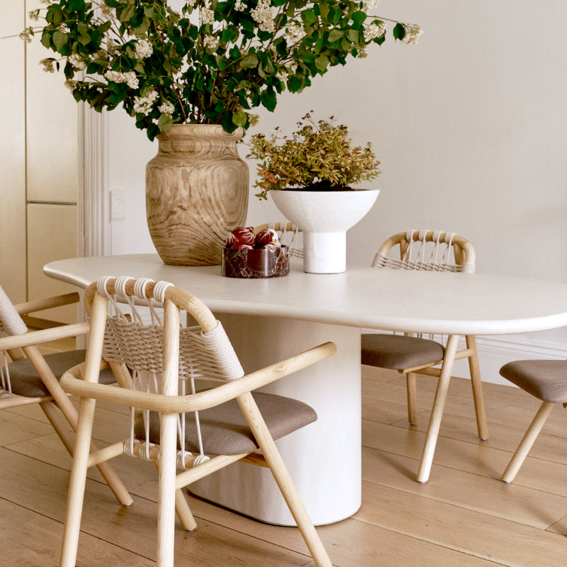
Now, whether you have room for twelve or space for two, the design powers that be say a dining table should never match its chairs exactly. Even the most traditional antique wood table, rescued from someone’s grandparents’ home, can take on a sophisticated second life when paired with chairs that add a sleek touch of modern style. The key is to get the contrast, the textures, and the materials right. Not too close, but not too far. There’s an art in choosing just the right fabrics, scale, and size.
Not sure where to start? Three design experts shared their top tips for choosing dining chairs to complement—not match—a dining table and create a space that feels intentional, styled, and, most of all, ready for entertaining.

Juxtapose Sleek with Natural
Dora Leigh Maddux of the Instagram account A Brooklyn Home juxtaposed the sleek look of her marble and white dining table with cane and black wood chairs, which have a warm, organic feel. Plus, they have a broader, more splayed impact than the iconic tulip-shaped table. “Because we opted for a contemporary, streamlined design with our tulip table, I wanted the chairs to have a natural element with warmer tones,” says Maddux.
Maddux explains, “This juxtaposition of modern, cold materials against softer, natural tones creates a more visually interesting story than a matching set and ties the other areas of the room together.” Because both the table and chairs have midcentury-inspired silhouettes, they complement each other without looking like they were purchased straight from a showroom. The natural caning of the chairs even echoes the parquet wood flooring, creating a beautifully cohesive but never-matching look.
Create Contrast between Old and New
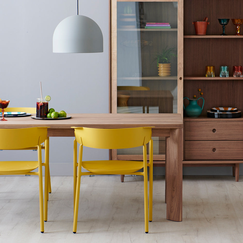
“For me, it's about creating contrast,” says Anthony Rodriguez of 136 Home, “Nothing is worse than matching your kitchen table's material and finishing it to the kitchen table exactly. I live for a lived-in moment.” Your space should look like it evolved, coming together as you found just the right pieces.
“Whether it be pairing a walnut antique piece with an uber-modern table, or pairing your marble tulip table with matte black and cane, I like things to look interesting with depth and character,” explains Rodriguez, adding that contrast is even better. In his home, he used Mulholland chairs and the gorgeous richness of a gold velvet banquette to both complement and contrast with his white and brass tulip table. It’s a meeting of old and new that catches the eye and proves that matching is a thing of the past.

Mismatch the Host Dining Chairs
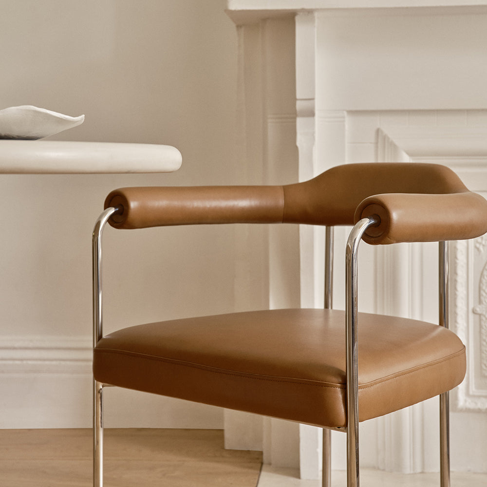
While complementing, not matching, chairs to a dining table is the first step, you can go even further by mismatching the chairs themselves. Eight chairs around a large dining table can create a consistent, streamlined look—or you can draw one or two out as a statement piece. By choosing a host chair that demands attention, you frame the table and create an artful, intentional contrast. Alida Coury of Alida Coury Interiors says, “Choosing chairs is different for each project. It depends so much on every item I'm adding in the room, and how the client wants the space to function. But a lot of times, I'm mismatching the host chairs.”
This can be done through varying the scale, fabric, material, and silhouette. Think of sleek, modern dining chairs contrasted with sculptural velvet armchairs at the end. It’s a dramatic look that’s perfect for avid entertainers.
Add in Texture
Where there’s rich organic texture on the dining table, like deeply stained wood or intricately carved details, use the chairs to add balance, color, and depth. Velvet and rattan can create a rich look while caning and linen keep things light and airy.
When Coury incorporates contrasting side chairs, she often uses that opportunity to add varying textures, metals, patterns, and fabrics. Each chair is an opportunity to introduce a new element to the larger design scheme, and by using different textures, she keeps the eye moving throughout the space, never growing stale on one look. “We introduce contrast in textures like rattan or caning, colors, patterns, or metal tones, or even the softness of fabric,” says Coury.
She adds one direction anyone can and should follow, “I try not to make rules and just let the design flow.”


